Web development was once about making the website functional; yet, this is no longer the case. Nowadays, it is about the user experience the websites provides. Nonetheless, websites that we design contain some UX inconsistencies like “jump cuts”. Those inconsistencies create some cognitive overload to the users. In other words, the designs are not very intuitive.
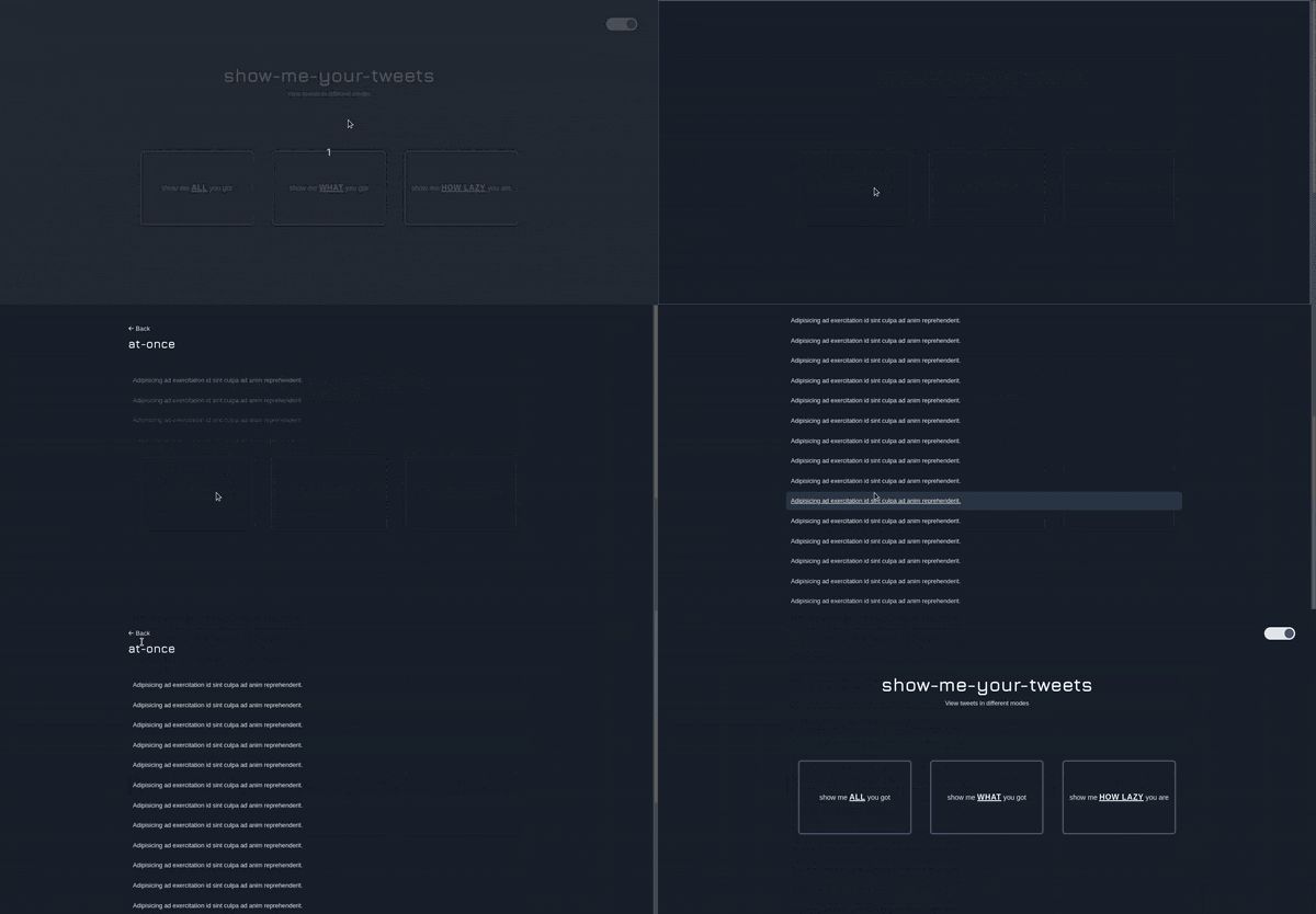
In this article, I introduce how you can create a smooth transition using Flip animation. Then, implement the Flip animation using react-flip-toolkit to create an aesthetically pleasing visual. Below is a sneak peek of the result.

Before jumping straightaway implementing a Flip animation, let us understand three basic things:
- What Flip animation is
- Why choose Flip over CSS animation
- Why opting for a Flip library like react-flip-toolkit
Content
- Flip animation definition
- CSS animation over Flip
- Why using a Flip library
- Implement Flip animation using react-flip-toolkit
- Resources
Flip animation definition
Flip is an acronym that was first introduced by Paul Lewis, which means First, Last, Invert and Play. I would not go in-depth about the reason behind those names. The key takeaway is that those are the steps required to create a Flip animation. An animation where the transitioning component scales or tweens to the final component.
CSS animation over Flip
Usually, to implement any animation, people would use plain old CSS. That can be an option, updating the top, left, right, bottom position and then setting a transition time. But, this way has a considerable performance impact when rendering the web page. It will not be a surprise to find some glitches here and there. Contrarily, using JavaScript to apply a scale transition is more efficient.
Why using a Flip animation library
As with every library that you use, it offers the advantage of not worrying about the underlying implementation. But, to rather focus on your own unique implementation. Flip animation is not hard to implement, but the worst part is that we will need to handle every edge case. Edge cases like browsers compatibility and listening to browser window size changes. For this reason, I chose react-flip-toolkit. A library that offers greater flexibility when creating transitioning animation. Here is a list of examples what you can achieve with react-flip-toolkit. Besides, it is also available for other JavaScript frameworks and JavaScript itself. But you will find it under different names.
Implement Flip animation using react-flip-toolkit
First set up a new React project and add the react-flip-toolkit to it.
npx create-react-app flip && cd flip && npm install react-flip-toolkit
From there, open the React project in your favourite editor. Then head to the App.js file and remove any unnecessary lines. Add the Flipper component that wraps the transitioning component SelectedMode.
import React, { useState } from 'react'
import { Flipper } from 'react-flip-toolkit'

function App() {
    const [tweetMode, setTweetMode] = useState(false)

    return (
    <Flipper flipKey={tweetMode}>
        <MenuScreen />
        {
            tweetMode ? (
                <SelectedMode id={`${modeName}-mode`} mode={modeName}/>
            ) : null
        }
    </Flipper>
    )
}
For this example, I used a ternary operator to display SelectedMode or not to avoid the use of CSS.
The import bit in the code above is the flipkey attribute from the Flipper component. This is how react-flip-toolkit knows when to play the animation. The attribute can be of any type: boolean, string, number.
Next, create a SelectedMode.js file, which is the card mode the user clicks to view the list of tweets. Wrap the content of the screen around the Flipped component and add the flipId attribute to it. The value of the flipId attribute maps to the mode name for the two components that are changing. For example, the card with mode 'at-once' would have a flipId of mode-at-once. So will the flipId of SelectedMode component.
import { Flipped } from 'react-flip-toolkit'

function SelectedMode({ id, mode }) {
    return (
         <Flipped flipId={id}>
             /* Content of the screen displaying list of tweets*/
         </Flipped>
    )
}
Lastly, create the Card.js file and include the code below. You will notice that there is an onClick function to change the tweet mode. In this case, we used the React Context API to create a hook, as we will need to access this value in App.js to trigger the animation. For the brevity of the article, try to implement useTweetModeToggle by yourself. If you find any difficulties, feel free to have a look at the GitHub repository below.
function Card({ mode, title, titleHighlight, description, descriptionHighlight}) {
    const toggleTweetMode = useTweetModeToggle()
    return (
        <Flipped flipId={`${mode}-mode`}>
            <div onClick={toggleTweetMode(mode)}>
                 /* Contents of the card mode*/
             <div>
         </Flipped>
    )
}
Resources
- react-flip-toolkit GitHub repository
- Talk about React and the FLIP Technique
- Flip animation article by Paul Lewis
- Examples of what is achievable using react-flip-toolkit
The example is from show-me-your-tweets, a web application I am working on for some weeks. There will be further articles coming based on it if you do not want to miss out, follow me on Twitter or Hashnode .
